Card styling
Part of the Building This Site series.
Last time out I fixed up my post page to make it more readable with some considered styling and typography changes. It's time to switch focus to the home page now, and see how we can improve the grid view of blog posts.
From boring to beautiful
ChatGPT had started me off with a bare-bones post grid with almost no styling except a random top border over each post 'card' which was an... interesting choice!
For once I knew exactly what I wanted this to be so I could be quite precise with my instructions.
I want a cool hover effect on the grid cards and I want the whole card to be a clickable link to the post
But this time I hit an unexpected snag. The responses up until now had been very specific and tailored to the code already generated. This time ChatGPT started off with the line:
Right now you probably have something like...
And this was followed by some CSS and HTML that was absolutely not like what we'd been creating!
Context matters
Not being an expert I spun up a new chat thread and asked what was going on. Why was I no longer getting suggested code that was specific to my site?
Well it turns out I probably hit a context limit and all the early work had fallen out of the AI's memory.
Having researched the topic very briefly it seems my use of a free online chat account is likely the main problem. Tools like Claude Code, which run locally on your computer and have the ability to both read and write files, appear to solve it. But I'm not yet ready to fork out for that.
The other suggested fix was to include relevant files along with the prompt to give the AI back some of that context, so that's what I did. After that, everything seemed fine.
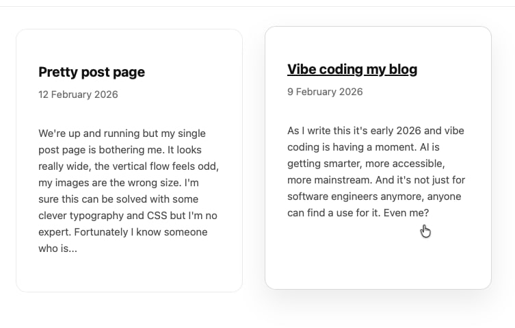
The end result
So after uploading my stylesheet and a couple of template files and re-prompting I got a really nice hover effect that includes a smooth animated transition to apply a drop shadow, the whole card is clickable, not just the blog title and it has a nice rounded border that matches the radius of the post images. Nice 👌
What's next?
I've got a few more things I want to address but I feel like I'm already getting quite close to how I want the site to be. On to the to-do list are:
- Post images on the grid
- Add some subtle splashes of colour
- Improve the header and menu
- Dark mode
See you soon!