Pretty post page
Part of the Building This Site series.
We're up and running but my single post page is bothering me. It looks really wide, the vertical flow feels odd, my images are the wrong size. I'm sure this can be solved with some clever typography and CSS but I'm no expert. Fortunately I know someone who is...
From senior dev to design guru
I fire up ChatGPT and hand over my CSS and post template files...
Hey, this post page looks a bit off. What would you suggest?
A few seconds later we have a plan of action:
- Constrain the line length for more readable text
- Make screenshots look embedded instead of dumped in
- Adjust various font settings for better typography
I'm given a bunch of CSS to drop into my stylesheet. It recommends a max column width of about 720px to limit line length to 60-75 words per line, some tweaks to font size, line height and paragraph margins and some padding, a subtle shadow and rounded corners for the screenshots.
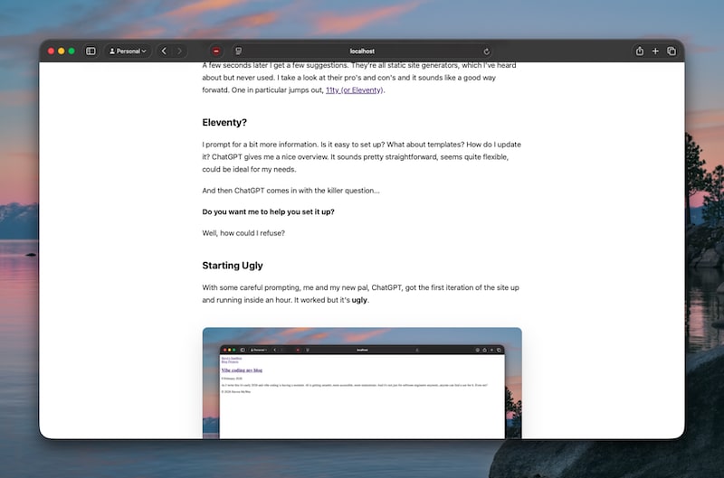
If I had tried to work this out for myself it would've taken me hours. Instead, after some cutting and pasting and a quick reload we go from this...
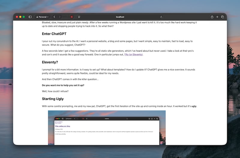
...to this...
That's a big improvement.
Next on the hit-list
With the post page looking good it's time to take a look at the main homepage which is going to be a paginated grid of post excerpts.
I'll see you again soon for that one!